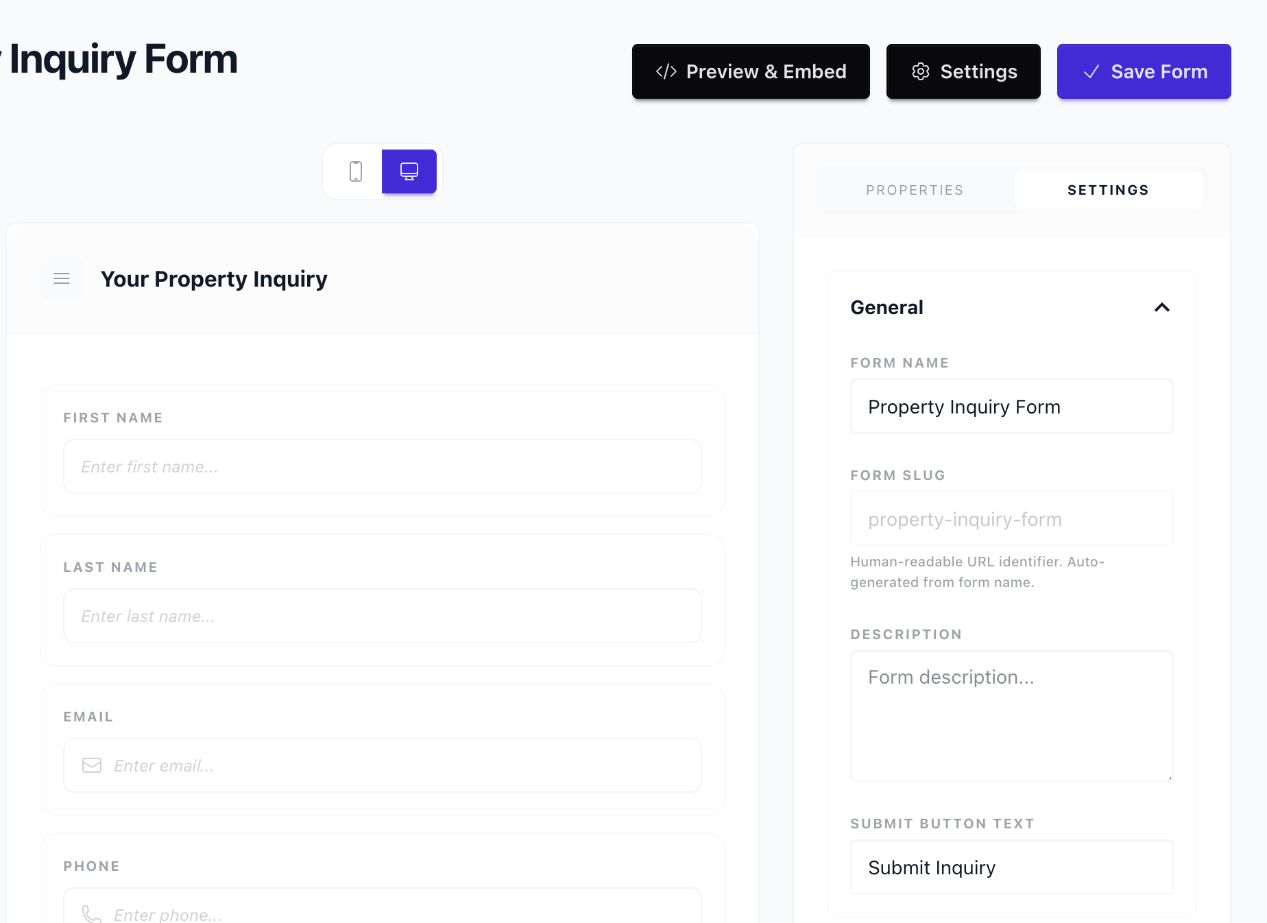
Form Settings
Where to find it
Sidebar > Forms > [Form] > Edit > Settings
Form Settings
Form settings control what happens after a user submits your form and how the form appears. Access them from the Form Builder toolbar: click Settings (or the gear icon) to open the settings panel.
Thank You Page
After a successful submission, users typically see a thank you message. You can:
Inline Thank You Message
- Message -- Custom text displayed on the same page (e.g., "Thanks! We'll be in touch within 24 hours.").
- Hide form -- Optionally hide the form and show only the thank you message.
This is the default behavior when no redirect is set. Good for embedded forms where you want to keep users on the same page.
Redirect URL
- Redirect after submit -- Send users to a specific URL after submission (e.g., a dedicated thank you page, a download link, or your homepage).
- Enter the full URL (e.g.,
https://yoursite.com/thank-you).
Use a redirect when you have a custom thank you page, offer a download, or want to send users to another part of your site.
Email Notifications
Configure email notifications so you (or your team) are notified when a lead is submitted:
- Notify on submit -- Toggle to enable or disable notifications.
- Recipients -- Email addresses to receive notifications (comma-separated for multiple).
- Subject -- Custom subject line (e.g., "New lead from Contact Form").
- Include lead data -- Option to include a summary of the submitted fields in the email.
Notifications are sent immediately when a form is submitted. Ensure recipient addresses are valid and can receive mail from Leadflip.
Branding and Design
Control how the form looks when embedded or viewed via direct link.
Alignment
Set the form-level alignment to control the horizontal positioning of structural elements:
- Left (default) -- Page titles, descriptions, and fields align to the left. Navigation buttons use a space-between layout: Previous on the left, Next/Submit on the right.
- Center -- Page titles, descriptions, image choice grids, and half/third-width fields all center horizontally. Navigation buttons are grouped together in the center.
Individual pages can override this setting. See Multi-Page Forms for page-level alignment.
Primary Color
The primary (accent) color controls the appearance of buttons, focus rings, selected image choice indicators, hover states, and links. Choose a color that matches your brand.
Text Color
Override the default text color for field labels, help text, descriptions, and other body text.
Background Color
Set the background color of the form container. Useful when embedding on pages with a different background than white.
Font Family
Choose a font family from a curated list of web-safe font stacks. The selected font applies to all text in the form -- labels, placeholders, help text, buttons, and page titles.
Logo
Optional logo displayed above the form (for standalone/direct-link forms).
Custom CSS
If supported, add custom CSS for advanced styling beyond the built-in design options.

Button Labels
Customize the text on form buttons:
- Submit button -- Default "Submit" or "Send". Change to "Get Quote", "Request Demo", etc.
- Next / Back -- For multi-page forms, customize "Next" and "Back" (e.g., "Continue", "Previous").
Clear, action-oriented labels improve conversion and reduce confusion.
Validation and Behavior
- Required field indicator -- Show an asterisk (*) or "Required" for required fields.
- Error messages -- Customize validation messages (if your plan supports it).
- Submit on Enter -- Whether pressing Enter in a single-line field submits the form (default: off for single-field forms, on for multi-field).
Security and Spam
- reCAPTCHA / hCaptcha -- If enabled for your account, turn on CAPTCHA to reduce spam submissions.
- Honeypot -- Invisible field to catch bots; optional and often enabled by default.