Field Properties
Where to find it
Sidebar > Forms > [Form] > Edit > Click field
Field Properties
When you add a field to your form, you can customize how it appears and behaves using field properties. Click any field on the canvas to open its properties panel on the right. The panel is organized into accordion sections: General, Options (for select fields), Appearance, Form, and Conditions.
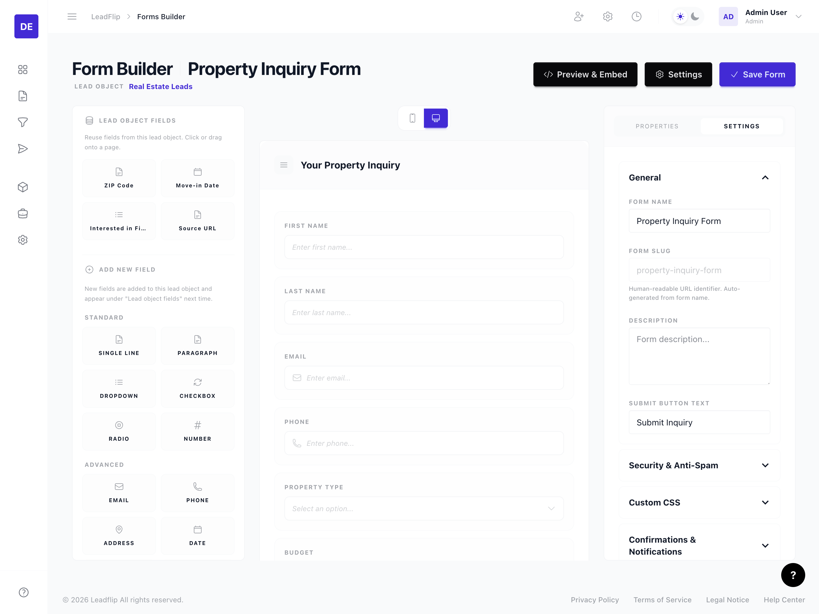
General
Label
The label is the text shown above the field (e.g., "Email Address", "Phone Number"). By default, it uses the Entity field label. You can change it per form to better match your context or branding.
Help Text
Help text (Description) appears below the field to provide additional guidance. Use it for:
- Format hints (e.g., "Use format: XXX-XXX-XXXX")
- Clarifications (e.g., "We'll use this to send your quote")
- Legal or policy notes
Required
Toggle whether the field is required. If required, the form won't submit until the user provides a value. This can override the Entity's required setting -- useful when a field is required in the CRM but optional on a specific form (or vice versa).
The Required toggle is located at the bottom of the General section.
Appearance
Placeholder
The placeholder appears inside the input when it's empty (e.g., "Enter your email"). Available for text, number, select (dropdown), and similar input types. Not available for image choice, radio/checkbox, toggle, or file fields.
Prefix and Suffix
Add text before or after the field value (e.g., "$" as a prefix for currency, "kg" as a suffix for weight). Available for text and number-based fields.
Columns (Image Choice and Radio/Checkbox)
For image choice and radio/checkbox list fields, control how many columns options are arranged in:
- Auto -- Automatically determines the best column count based on the number of options. Up to 5 options uses one column per option; more options finds the best even divisor.
- 1 through 5 -- Manually set a fixed column count.

On mobile devices (below 480px), image choice cards automatically switch to a horizontal list layout with the image on the left, option label in the center, and selection indicator on the right, regardless of the column setting.
Width
Control the field width within the form layout:
- Full width -- Field spans the entire form width (default)
- Half width -- Field takes 50% of the row; pair with another half-width field for side-by-side layout
- Third width -- Field takes one-third of the row for compact layouts
When the form or page alignment is set to Center, half-width and third-width fields are centered horizontally on the page. Two half-width fields side by side still fill the row; a single half-width field centers within the available space.
Other Appearance Options
- Hide Label -- The field label will not be shown in the rendered form.
- Hidden Field -- The entire field is invisible but still collects data (available for text and number-based fields, dropdowns). Useful for passing UTM parameters or pre-filled values.
- CSS Classes -- Add custom CSS classes to the field wrapper for advanced styling.
Options (Select Fields)
When a field uses a Select base type, the Options section lets you configure:
- Display as -- Choose between Dropdown, Radio / Checkbox list, or Image choice.
- Allow multiple selections -- When enabled, users can select more than one option.
- Edit Options -- Opens the options drawer where you manage choices (label, value, show/hide, reorder).
Hiding an Option Without Losing Data
In the Edit Options drawer, each row has an eye icon next to the drag handle.
- Click the eye icon to hide the option from the public form. An eye-slash icon replaces the eye, and the row dims.
- The hidden option still exists in the Entity and is still present on any lead that previously selected it -- nothing is deleted.
- In the CRM, hidden options still appear in the condition builder with a
(hidden)suffix so you can keep filtering on legacy values. - In CSV exports, stored values continue to resolve to their proper labels.
Use this to retire a choice that should no longer be selectable (for example, a tax year that is no longer legally claimable) without losing historical lead data or breaking existing filters and reports. If you hide every option on a field, the drawer shows a warning -- the field will then offer no choices on the public form.
Image Upload for Image Choice
When the display type is set to Image choice, each option in the Edit Options drawer shows an image slot:
- Click the upload icon next to an option to upload an image.
- Supported formats: JPG, PNG, GIF, WebP, SVG (max 2 MB per image).
- Uploaded images appear as thumbnails in the drawer and as card images in the form.
- Hover over an uploaded image to reveal a red X button to remove it.

Form
Default Value
Set a default value that pre-fills the field when the form loads. You can enter a static value or insert a field reference to dynamically populate the field based on a previous field's value.
To insert a field reference, click the code button in the editor to open a dropdown of available fields. Only fields of compatible types that appear earlier in the form are shown. When the referenced field's value changes, the default value updates in real-time.

Enable Calculation (Numeric Fields)
For number, currency, percentage, and slider fields, toggle Enable Calculation to define a formula. When enabled, a formula editor appears where you can reference other numeric fields and use arithmetic operators. See Calculations & Formulas for details.
Conditions
The Conditions accordion lets you configure rules that show or hide this field based on other field values. This is the same feature available for page-level conditions -- both use the label "Conditions" for consistency.
See Conditional Logic for details on operators, combining conditions, and best practices.
Properties by Field Type
Select and Multi-Select
- Options -- Managed via the Edit Options drawer. Options are stored on the Entity.
- Display as -- Dropdown (default), Radio / Checkbox list, or Image choice.
- Columns -- For radio/checkbox and image choice, set the grid column count.
Number, Currency, and Percentage
- Notation -- Dot (1,000.00) or Comma (1.000,00) formatting.
- Decimals -- Number of decimal places to display.
- Prefix/Suffix -- Text before or after the value.
- Slider -- Toggle to render as a range slider instead of a number input.
- Min/Max/Step -- Set value boundaries and increment.
File Upload
- Accepted file types -- Restrict to specific extensions (e.g.,
.pdf,.jpg). - Max file size -- Limit upload size in MB.
Textarea
- Rows -- Initial height of the text area.
- Max length -- Character limit (if set on the Entity).
Inheritance from Entity
Many properties inherit from the Entity. If you change a field's type, options, or validation in the Entity, those changes flow to all forms using that field. Form-level overrides (label, placeholder, required, width) take precedence for display but don't change the underlying Entity definition.